WeatherPro has been a success story for the last 7 years since the very first release of the iPhone. It has been transfered to all Mac platforms and five others such as Android, Windows, Blackberry, Symbian and WebOS. I supported all that development as designer.
BLUE is the color of WeatherPro. That it makes recornisable as no other weather app in the market.
WeatherPro has made a lot of transormation over the last seven years. It mostly simplyfied a lot. The app icon the same as the whole UI. And it's still in a continious change.
Ever again we tried to simplify the structure of the app as well, but without great success. The complexity of visualized data has ever been a proclaimed USP of WeatherPro.
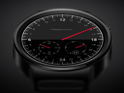
WeatherPro for Apple Watch and Android Wear
This is the original sketch of the "weather rose" I drew, when we have been on the flight to San Francisco on our way to the Apple Campus in Cupertino.
The development for the Apple Watch such as Android Wear has been a big step for the design of WeatherPro. Here we got the space to implement new ideas of how to present weather data ina new way.
Android wear got a quite different UI regarding the Apple Watch just for the reason Android gave us more possibilities to integrate the app deeper into the watch and set it as watch face up front.
ARCHIVE // older designs from 2012 and ealier


